RASTRO TEQUILA
THE BRIEF
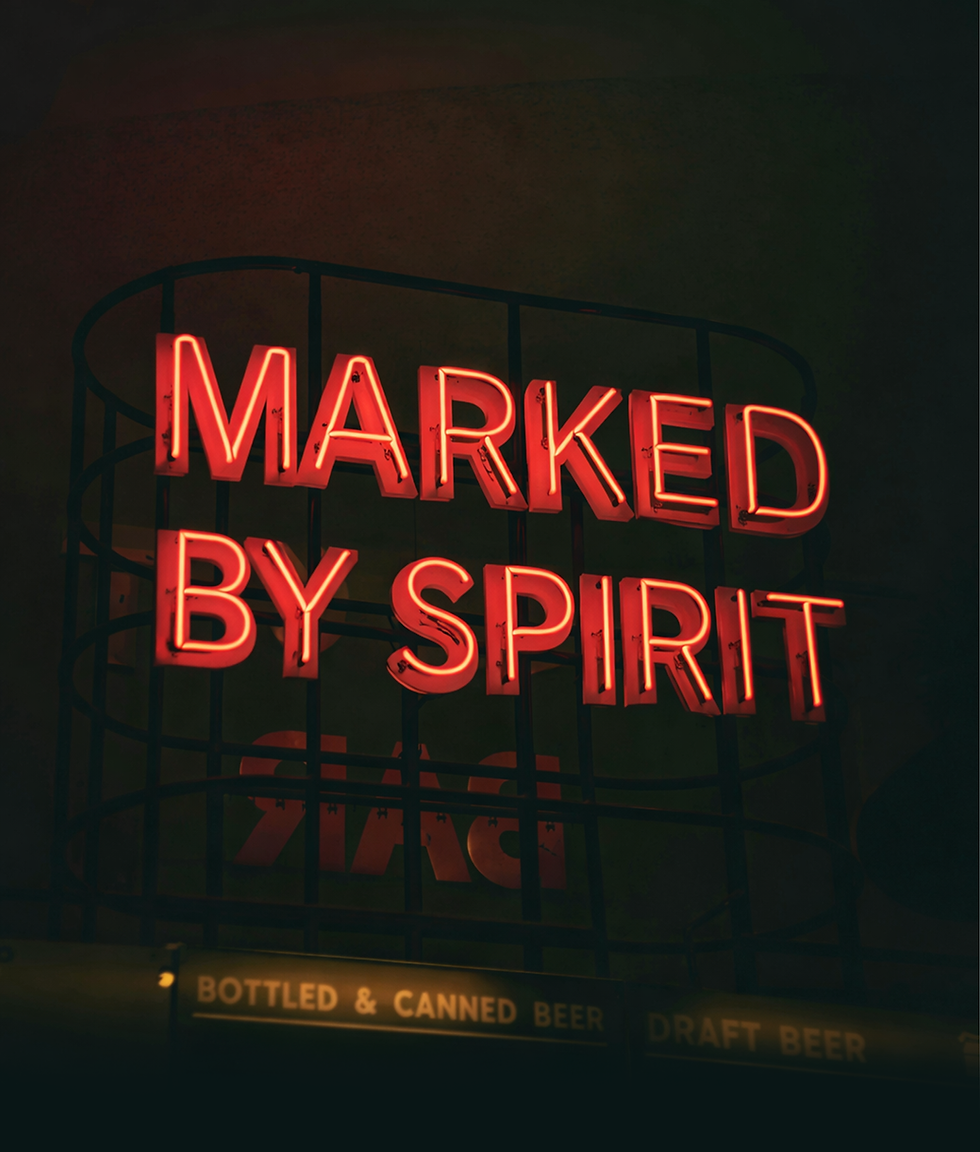
Rastro set out to launch a tequila with presence. Smoky, bold and driven by personality rather than process.
The first release, Ignacio’s Ember, needed to establish the tone for the brand. Inspired by its founder, the bottle and identity had to express depth, intensity and confidence, while quietly defining a visual language capable of expanding into future expressions.
The brief called for a full brand identity and packaging system that could command attention on shelf and in hand, supported by promotional assets for social media and brand activations. The work needed to feel raw but refined, premium without polish, and distinctive enough to cut through a crowded spirits market.


THE OUTCOME
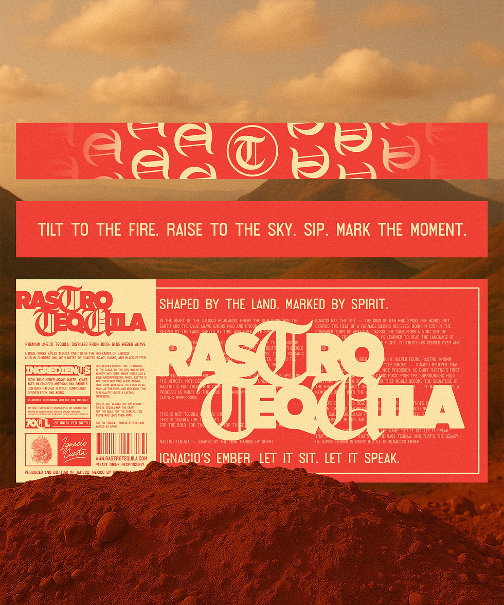
The outcome is a bold, character-led identity that gives Ignacio’s Ember a clear sense of purpose and presence.
The branding and packaging capture the intensity and smokiness of the tequila while translating founder influence into a strong visual direction. Every element works together to give the bottle confidence on its own, without relying on trends or familiar spirits cues.
Although only one variation exists to begin with, the identity defines a clear visual logic for future releases, allowing new flavours to be introduced, while still belonging to the same world.

TRIGO
© 2026 by Trigo